Client
Trypod is a company that builds digital platforms to help connect customers with the right companies.
Project duration
April-May 2019
Brief
Design a corporate identity for the company that clarifies that the company is trustworthy yet neutral enough to not appear trendy or era-specific or appear to belong in a specific industry.
Challenges
Balancing the appearance of neutrality yet make it visually pleasing.
To incorporate the company’s Scandinavian roots visually.
The work
We started with a branding workshop to get an idea of what the brand is and why. What is it’s core and who should it speak to? The results of this workshop were crucial for the evaluation of ideas later.
As with the majority of corporate identity work, good old fashioned sketching (pencil + paper) to get a lot of idea directions out, followed by evaluation.
Solution
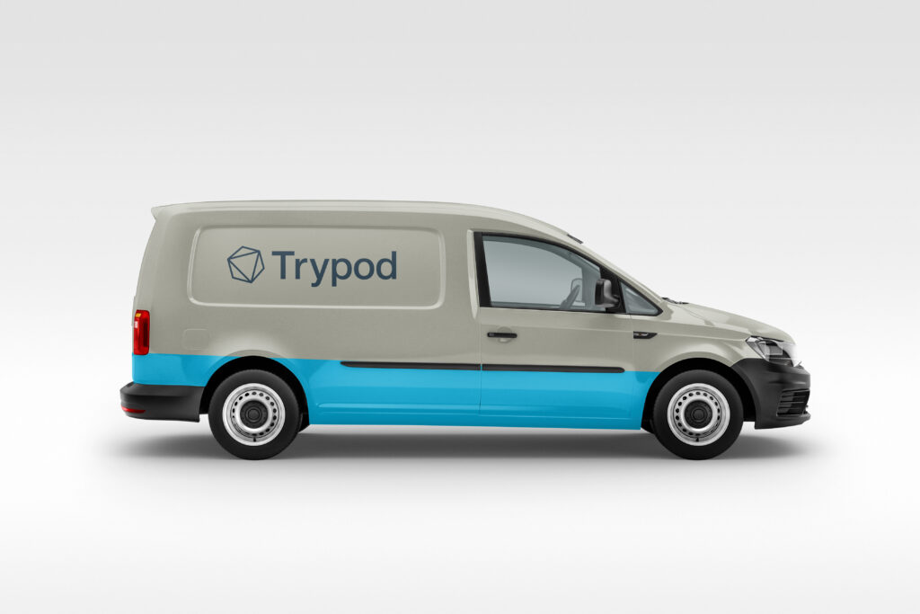
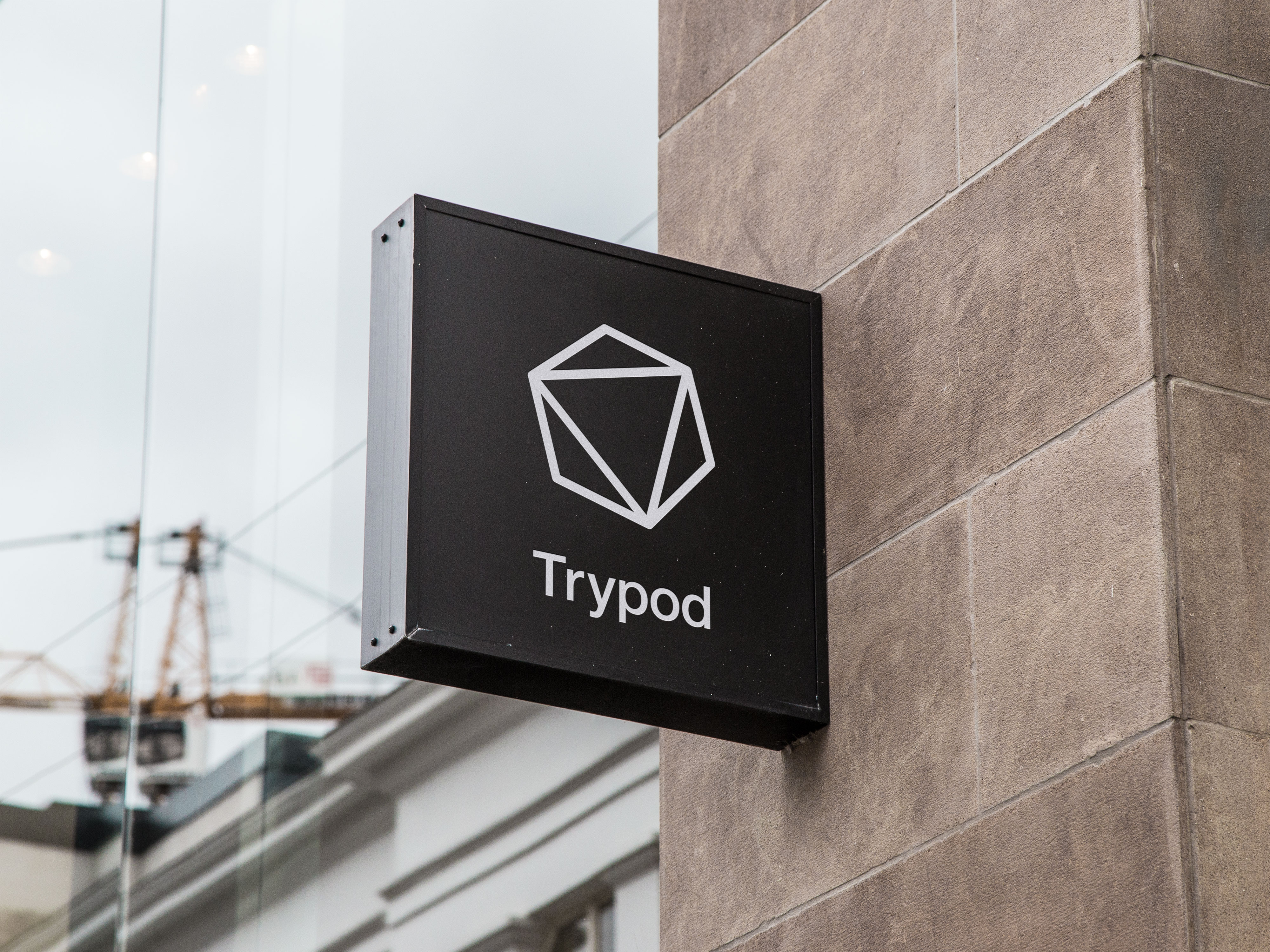
The symbol (the pod), symbolizes the core from which everything originates. The triangle in the center represents the three founders and how they each possess a unique and necessary quality to the stability of the business. The three legs that make up a stable tripod for example. Each one is equally needed for stability.
The Logotype is very neutral in its choice of typeface. Not modern, not old, not techy, not new age, not hip, not dull.
The color scheme is rooted in Scandinavian tones of birch, granite, the seasonal light as well as traditional colors used in old decorative paintings (Kurbits) from a region in Sweden called Dalarna.
Team
Prep/workshop: Stefan Leijon, Xue Mei Rhodin & Marcus Flodén.
Design: Stefan Leijon
Website

